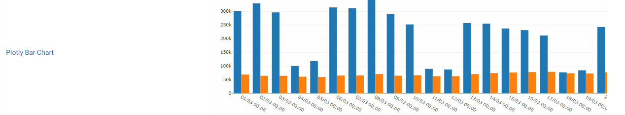
Staafdiagram
Bar Line Chart
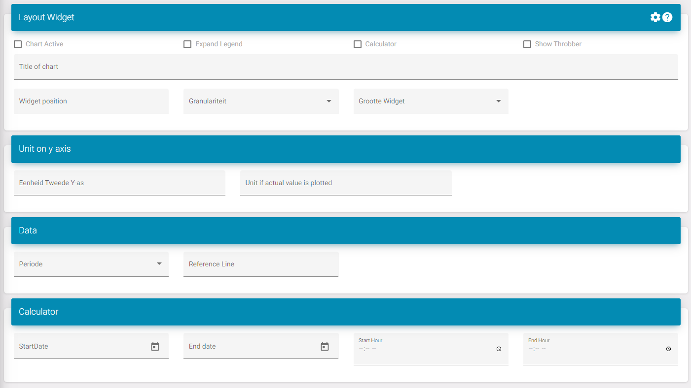
Instellingen
Grafiek actief: Activeert de widget op het dashboard.
Legende uitbreiden: Dit vergroot de ruimte onder de widget waardoor er meer datapunten zichtbaar zijn zonder een scrollbalk.
Toon laadbalk. Je kunt dit inschakelen als je het laadpictogram wilt zien wanneer nieuwe gegevens naar het portaal worden verzonden.
Titel: Dit is de titel van de widget.
Widgetpositie: Dit is de positie van de widget in de lijst op het dashboard.
Widgetgrootte: Dit is als je meerdere widgets naast elkaar wilt zien.
Om te weten wat te selecteren moet je het dashboard als 12 delen zien. Hier is een lijst om te zien hoeveel delen een grootte inneemt:
-
XXL: Volledige grootte/ standaard; 12/12
-
XL: 10/12
-
L: 8/12
-
M: Halve; 6/12
-
S: 4/12
-
XS: 2/12
Periode: Selecteer wat de standaardperiode is wanneer het dashboard is geladen. Bijv. Maand, zodat wanneer je het dashboard opent je het niet hoeft te bewerken zodat het gegevens voor een maand toont.